Trend Report: Handwriting Influences
Some fonts are only possible with computers.
Trends reports are a column where we talk about the recent popular things to do in fonts, whether it be adding layers to fonts, giving away extras and dingbats for free, or making huge collections of fonts that allow you to build all elements of a design comp from a single family or collection.
One upon a time, there were two broad categories of fonts: fonts that mimicked hand writing or scripts, and fonts that were scanned from printed fonts. The former was usually drawn by hand and then scanned, whereas the latter was a scan of something from a printing press, or more traditional carved letters. This was much easier to classify, and the purposes were distinct as well. If you wanted to have an invite for a wedding, or try to make something look like someone wrote it themselves, you’d use a script font, or a handdrawn font. If you wanted to type up a paper or make a big headline, you used a sans serif or serif font that came from typesetting. Now that we’re solidly in the digital age of fonts, designers are starting to experiment with these forms, and blurring the lines between what we one had rather distinct.

A very clear example of this melding would be in a font like Macarons Sketch by Latinotype. The letters have a very traditional serif feel, something ready to go into a book or newspaper as text, but the lines are all distorted and uneven, like someone was tracing them and took more than one attempt. It takes your expectations of how the lines will be drawn, and turns them on their head. This type of writing is great for foodie blogs, which is also where it drew its inspiration.
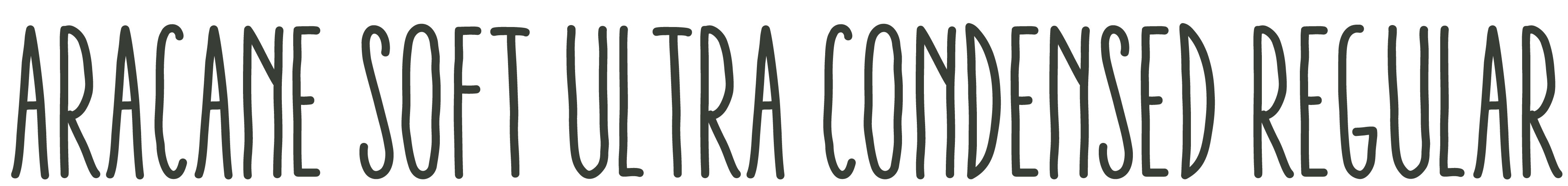
Another large category in this new trend is thin, condensed, handrawn fonts like Aracne Condensed by Antipixel. These fonts look handdrawn, and most likely are, but are just perfect enough that they’re being used in places where you normally would see a more traditional display sans. These fonts don’t really look like anyone’s handwriting, they really look like what they are, a desire to create something easily legible that doesn’t take up too much space, and also gives a more warm approachable feeling to modern posters and ads. There’s a reason they’ve become so popular.
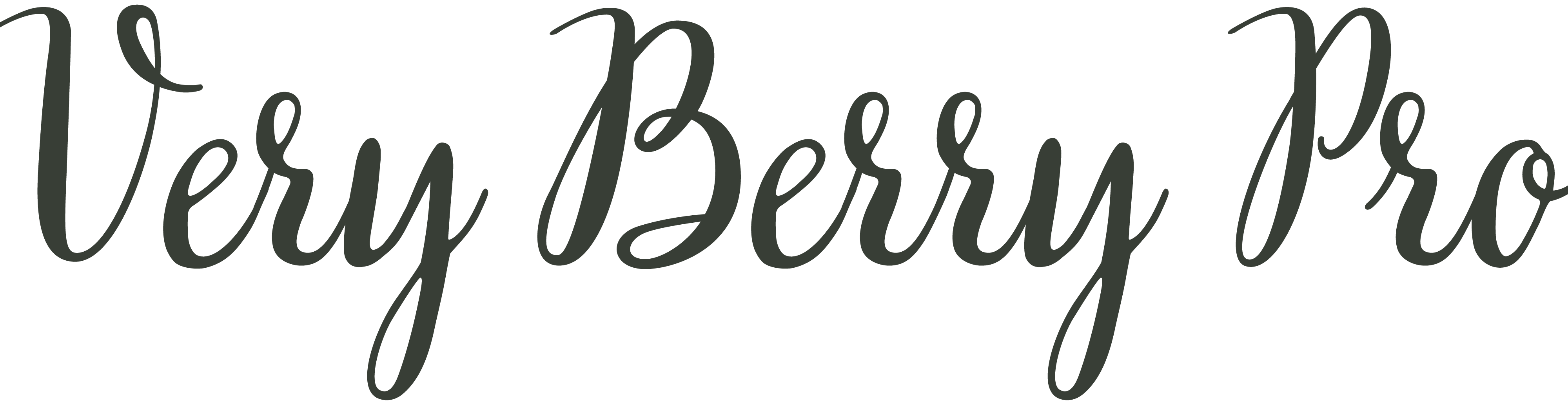
Finally, the precision of a computer allows the creation of incredibly clean and perfect looking scripts, a type of font rapidly growing in popularity. Veryberry Pro by My Creative Land is a fine example of this, it not only incorporates a very precise feel, but it also makes use of discretionary ligatures and other Opentype features, something else only possible through computers.
Whether it be adding some handdrawn feel to normally very rigid lettering, or making precise that which would normally be uneven, computers are opening up new categories in between what we’d normally see in typography, and broadening designer’s choices as a result.