What fonts are we using on the blog
We get this question all the time, so here it is!
A common question we get is “what fonts are you using on your site?” I guess we should expect it, we are a font company after all, our opinions probably matter. If we sell fonts for a living, there’s really no greater endorsement than for us to use a font ourselves. So without further ado, here are the fonts we’re currently using on our site.
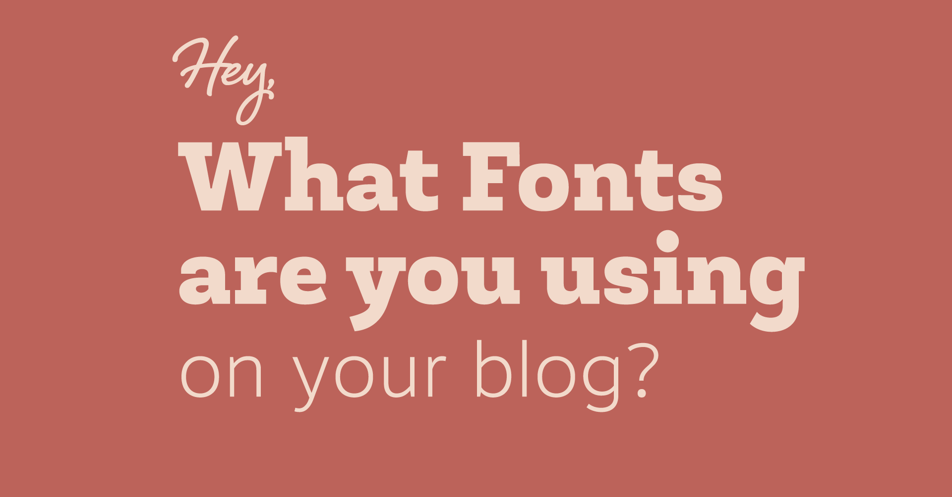
Headlines: Newslab by Latinotype.
Though it’s not as popular as it was a year or so ago, we’re still big fans of using a slab serif for headlines, and we thought Newslab fit in just right. We went through some other options that we worked in varying degrees. For example we started with trying Museo Slab, a perennial favorite, and while it was beautiful, it didn’t quite fit the look we had in our heads. Newslab had the feel we liked, and honestly, so much of it is a gut thing. We went with the extrabold weight, which was just thick enough to stand out but still be legible. We also liked the black version though, featured above.
Body Text: Motiva Sans by Plau.
This one was a personal choice by me. I’ve been saying for a long time that this font doesn’t get enough attention, so when I finally had an opportunity to give it a little more attention, I jumped at it. It’s easily legible at small sizes on paper or on the web, and has just enough style that it looks contemporary without sticking out too much. It also works exceptionally well as a thinner font, which is what we wanted, helping make it more readable on PCs at small sizes due to the hinting. In a world where it’s hard to stand out as a sans, I’m still hoping this one keeps growing.
Our Logo:
Script: Shelby by Laura Worthington  If you’ve been a longtime subscriber to our newsletter, you know we talk about Laura Worthington a lot. Like, a whole lot. There’s good reason for this, as she really does come up with some pretty incredible work in a variety of styles. Shelby is more a simple script in a handwriting style, and we felt like it suited the nature of our blog perfectly.
Sans: Gesta by Rui Abreu
I won’t say much about Gesta, other than we used to use this as all of our body text on Fontspring, we’re fond of all of Rui Abreu’s work. One caveat: while we think it works just fine in normal settings, the G didn’t have what we wanted for our logo, so we modified it. If you’re looking at the font and thinking “heeeeey something’s different” that’s probably why.


