Trend Report – Extras
Dingbats and ornaments and bears, oh my!
This is our second of a weekly blog on Font Trends. Tune in every Tuesday as we look at what Font Designers are doing to keep up with the times. Missed the first one? It’s all about layers, and you definitely should check it out too.
Getting tired of seeing silhouettes of animals incorporated into every rustic design these days? I hope not, because this is only getting more popular, and it’s because of this week’s trend: Extras.
Text is one of the most important parts of a design, but it’s not the only part. Icons, pictures, colors, all of these are other elements used to bring everything together or add interest to an image, and while choosing a font for letters has always made sense as it’s rarely worthwhile to design your own text for most projects, those extra design elements that go with the letters were often made by hand. It wasn’t until somewhat recently that people started using fonts to fill this need too. Dingbats fonts go back a long way (everyone remembers wingdings, for example) and Icon fonts had brief stints of mass popularity as well. Foundries were often including optional extras like banners or other little elements, but they were usually a minor afterthought. Then things started changing.

As more and more foundries started including banners, icons, pictures, backgrounds, or textures in their fonts, some foundries took the next logical step and started including them for free. While originally designers were hesitant to pay for things they could just design themselves, including them for free lead to more and more designers incorporating them into their designs, and as a result, a large amount of display-type fonts come with extras and dingbats now. It’s become almost mandatory, as foundries continue to compete by offering exceptional value as well as the best designed fonts. Yet another case of the super useful becoming widespread and expected. Let’s dive into some examples of different kinds of extras that compliment their fonts best.
Ryan Martinson was one of the first foundries to include his extras for free, but he also deserved a highlight for Thirsty Rough. Ryan’s fonts have some fantastic texture and roughness, which is getting increasingly more popular, so what does he do for Thirsty rough? he includes the textures as a free extra. These versatile patterns can be used in a variety of applications, and now you can distress your other materials to match your fonts.
Nexa Rust by Fontfabric was a smash hit on release for many reasons and one of them is the breadth of extras included. These images make some great backgrounds or features to add interest to an image, and there are all kinds! We’re highlighting some of the animal dingbats in our image because as nature themes start becoming ubiquitous with contemporary design, these extras prove to be incredibly helpful. I mean just look at the amount of animal imagery on Etsy these days, it’s everywhere!
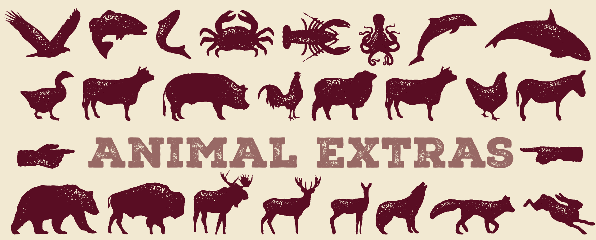
Finally , True North Textures by Cultivated Mind has a lot in common with Nexa Rust, including animal images, but it also has something else useful: banners. Creating banners may not be incredibly difficult, but including them as a font not only saves a designer time but guarantees that the banners fit the overall design of the font.  So what do you think? Do extras play a big part in your font buying choices? What other uses have you found for dingbats? Let us know!