Trend Report – Layers
This is our first of a weekly blog on Font Trends. Tune in every Tuesday as we look at what Font Designers are doing to keep up with the times.
Layered typography. Done well, it can look visually interesting, and add dimension and excitement to a design. Its limited accessibility and moderate difficulty was one of the main reasons we didn’t see it more often. Now with layered fonts, it’s easy to achieve that effect for anyone, so it should be unsurprising that they’re a big trend in the world of fonts right now.
3D effects and layers in design is not a new concept, by any means. Designers have created logos and other design elements with interesting shading or layers by hand in all kinds of designs, but the difficulty of designing them made them less prevalent. Now, however, font designers are building these features into their fonts, making layering as simple as stacking fonts in a document to create a variety of effects. They’ll often add rough or shaded designs, with 3D backgrounds, all as choices. The result? It’s now much easier to incorporate these looks into your design, and as a result, we’re seeing them more than ever. It’s a really simple way to bring vintage vibe, for one thing, or skip the hand-made shadows and use ones built in. It’s also trendy, and who doesn’t love being trendy?
Core Magic is a fantastic example of this. You can make it inline, you can make it rough, you can make it 3D, you can make it striped, or a combination of all of these. Some shadows come built in, so you can incorporate them with having to make your own.
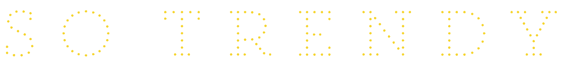
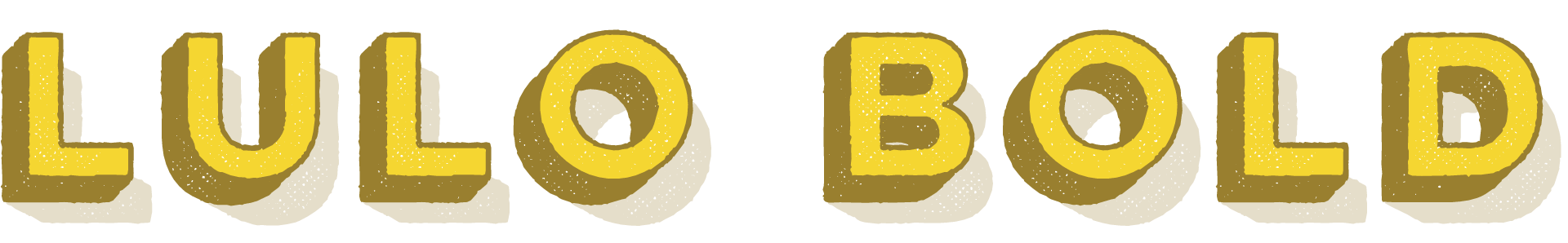
Lulo is another creative use of layers. By stacking the layers in different ways, you have completely different looking fonts that fit a variety of design uses. Put some color into the various layers, and your logos might as well be pre-built.
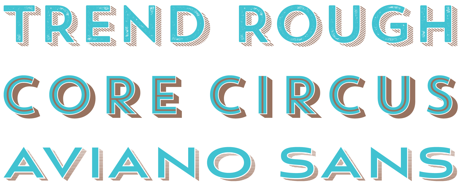
These are but a couple of examples in the sea of fonts that do layering well. A few we love include Trend, Core Circus, Aviano Sans Layers, the list goes on and on.
Another great side-benefit of layered fonts is that they also work as webfonts without the need to make them static images. It’s so cool, we even made a tutorial on how to use these fonts this way.
When it comes to fonts, the design of the font is still the most important feature, but 3D effects are one of the ways foundries are adding value to their fonts, setting themselves apart. As this technology grows, I have no doubt we’ll be seeing more fonts try layers in new and creative ways.
So what do you think? How do you want to see layers used in the future? What font do you think uses layers the best? We’re always eager to learn more. Oh and don’t forget to come back next week, when we talk about our next trend: Extras.