Book Review: The Golden Secrets of Lettering
Martina Flor’s book is as much a work of art as it is about creating works of art.
You’ve heard it a million times: Don’t judge a book by its cover… unless of course, the author is a professional lettering artist, in which case you can expect the quality of the cover to match the quality of the content. It all becomes a bit meta when a significant part of the book’s content is the author explaining how she designed its cover. Suffice it to say that the pages of Martina Flor’s The Golden Secrets of Lettering live up to their gorgeous outer binding, and offer an exciting look at lettering.
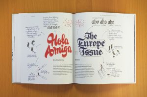
The Golden Secrets of Lettering is not about fonts or calligraphy, a distinction Martina Flor makes clear in the first chapter. She chooses instead to offer a look behind-the-scenes of hand-crafted lettering (a set of words where each individual letter is drawn from scratch and designed for a limited use to tell a cohesive story). Nevertheless, the topic of attractive letterforms is one that resonates here at Fontspring. Flor focuses on six basic guidelines: consistency, detail, one-of-a-kind, storytelling, good letter shapes, and creating something new. These ideals are stressed in the text and also evident in the physical book itself.
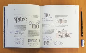
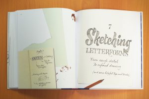
Golden Secrets reads somewhat like Harry Potter’s potion textbook from the Half-Blood Prince, with helpful handwritten hints and doodles in the margins for aspiring type wizards. Martina Flor bestows her vast knowledge to the reader in an encouraging tone as if she were sharing her secrets to success with a friend. Her contagious passion for lettering overflows into every corner of the book.
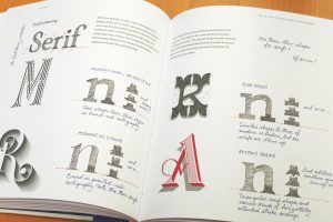
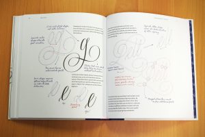
Chapters one through five cover the basics and terminology of letters while chapters six through ten are more hands-on, for those seeking to improve their craft or get a foot in the door. Even for the typographic aficionado, there’s quite a bit of gold to be mined here. When covering the basics, she points out valuable nuggets like specific details of optical adjustment, when to implement an overshoot, and the difference between the size of a period vs. ellipses.
Every page is visually engaging and a delight to read from cover to cover. It’s also a quick read since Martina gets right to the key points with very little filler. This adds to its shelf-life, as you won’t mind coming back to it from time to time when you need inspiration or a refresher on basic type guidelines. Her handwritten notes often encourage the reader to think outside of the box, for instance, “How many ways can you draw a lowercase f?”
William Morris once said, “Have nothing in your house that you do not know to be useful, or believe to be beautiful.” Martina Flor’s The Golden Secrets of Lettering is both beautiful and useful. You’ll want to keep it handy on your shelf so you can pull it out for reference. Just make sure to give it a good spot where you can still gaze upon the cover when it’s not in use.
Additional Resources:
Visit www.martinaflor.com to see Martina Flor’s lettering work and merchandise.
#goldensecretsoflettering on Instagram