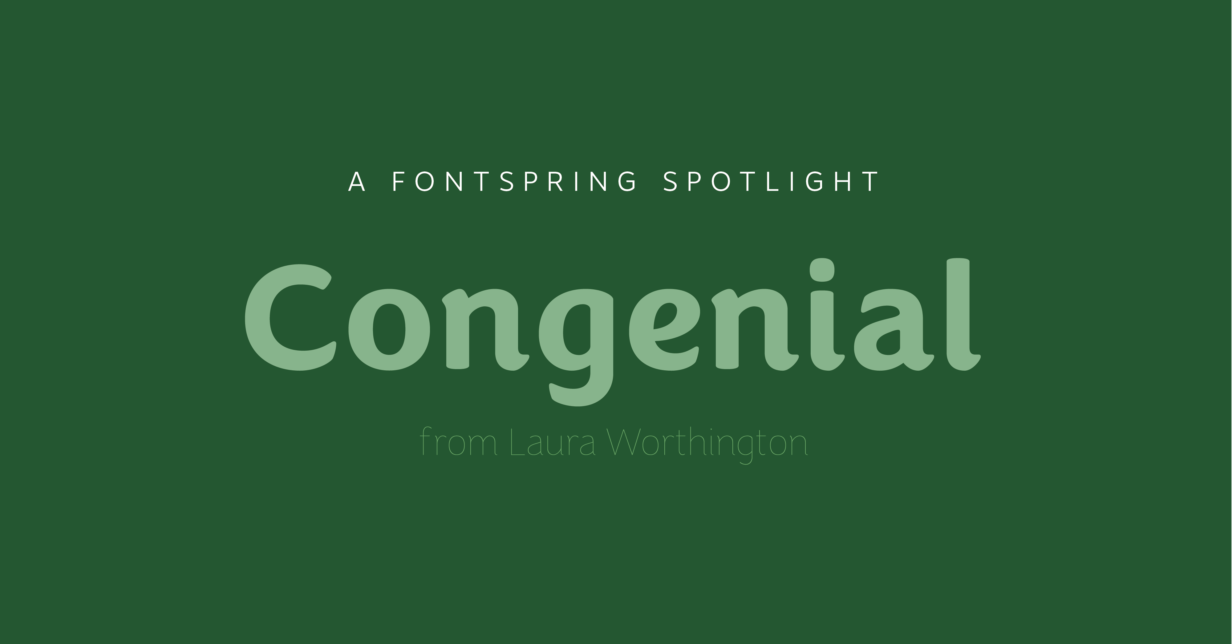
Font Spotlight: Congenial.
A cursive sans-serif from Laura Worthington
Sans serif fonts have become a crowded field lately. You can find high quality fonts for just about every use, and the vast majority of them are clean and professional. There’s nothing wrong with that, we happen to love them, but sometimes you want something a little different. You want some character in your sans, without sacrificing legibility. That’s where Congenial steps in. Laura Worthington decided to create the font to have a sans in her own catalog she could use in her projects. Once she decided to create it though, instead of dipping her toes into the world of text fonts, Laura dives in headfirst with a 10-weight fully featured family.
 These weights allow you to pick just the right thickness for your project, without wishing you had a weight that was a little thicker to fit your text (although let’s be honest, there could be 1000 weights and we’d want an in between weight sometimes). It’s also especially helpful for this font, because the hairline weight and heavy weights make great display variants, going along with the cursive roots.

This tendency towards display use even extends to all caps, which retain just enough of their lower case partner’s flare to stick out.  Enough babbling from me, you really should try this font. So go check it out in all its glory over at Fontspring.


