
Typographic Feng Shui and OpenType
Make your typography more beautiful by using these five OpenType features.
The devil is in the details. You want your designs to look clean and inviting, with everything in its right place. Perhaps you found the perfect font, but you don’t like the way a certain letter combination looks. These little annoyances can often keep us from seeing a clear vision of how things are meant to be. Here are five ways OpenType features help us reduce visual clutter, make the best use of space, and achieve typographic feng shui.
Flow
Words are meant to be read. An awkward overlap of letterforms can often look clunky and distracting. When necessary, using OpenType alternates and appropriate ligatures is a great way to guarantee a fluid read.
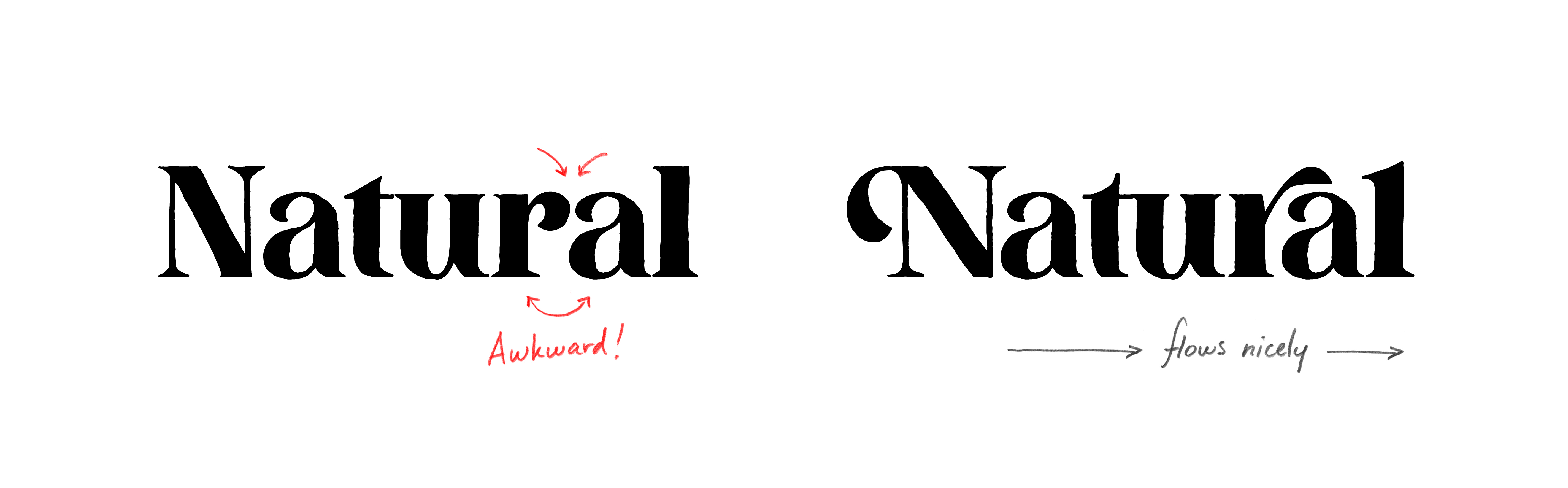
Font used: Proprietor Roman
Clarity
When our eyes see “9 3/4”, the voice in our head might immediately say “ninety-three” before feeling silly and realizing it’s obviously “nine and three quarters!”. Save your reader a little bit of mental energy by using OpenType formatted fractions whenever applicable.
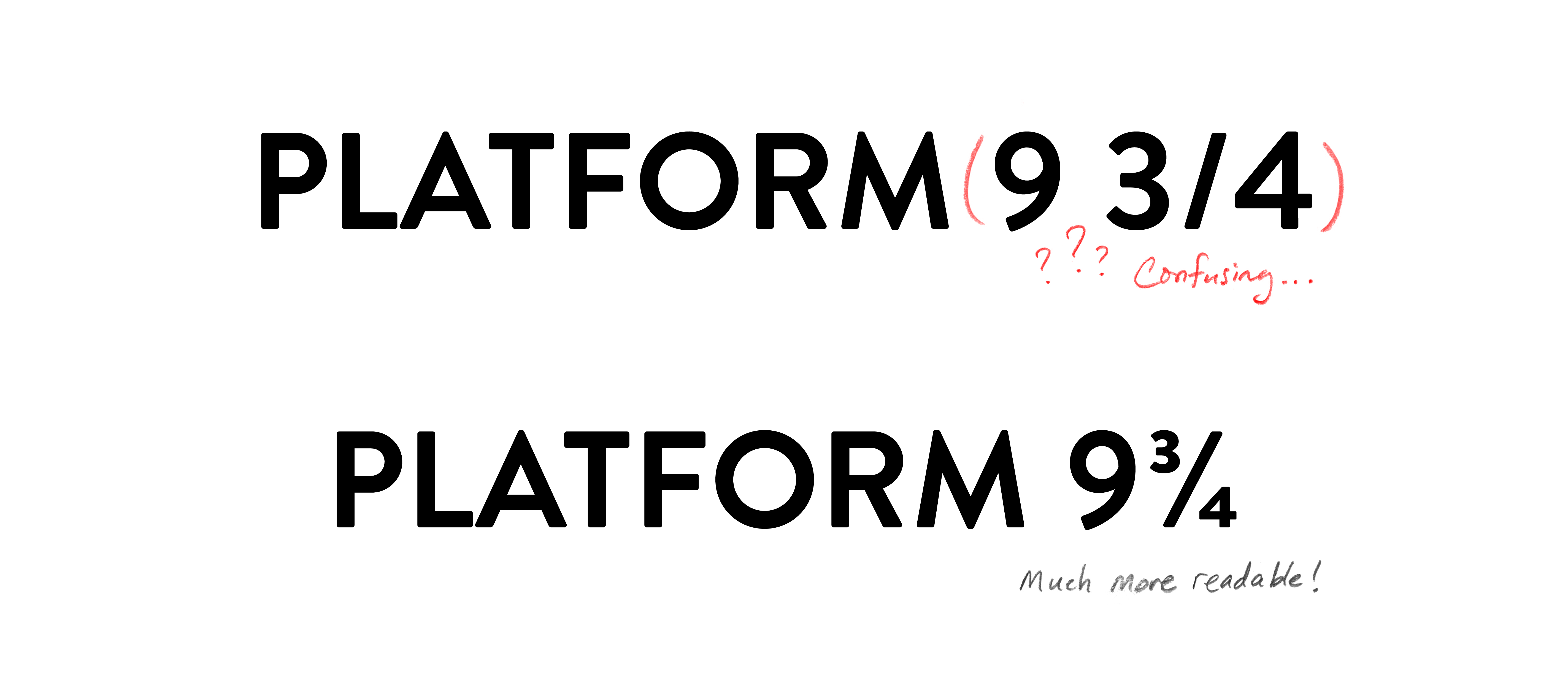 Font used: Brandon Text
Balance
An unbalanced word in a title or logo can often look boring and empty. Use OpenType swashes and flourishes to balance and frame your work by filling in any looming empty space above or below a word. Be careful to not go overboard with this technique as too many overlapping strokes could start to look cluttered.
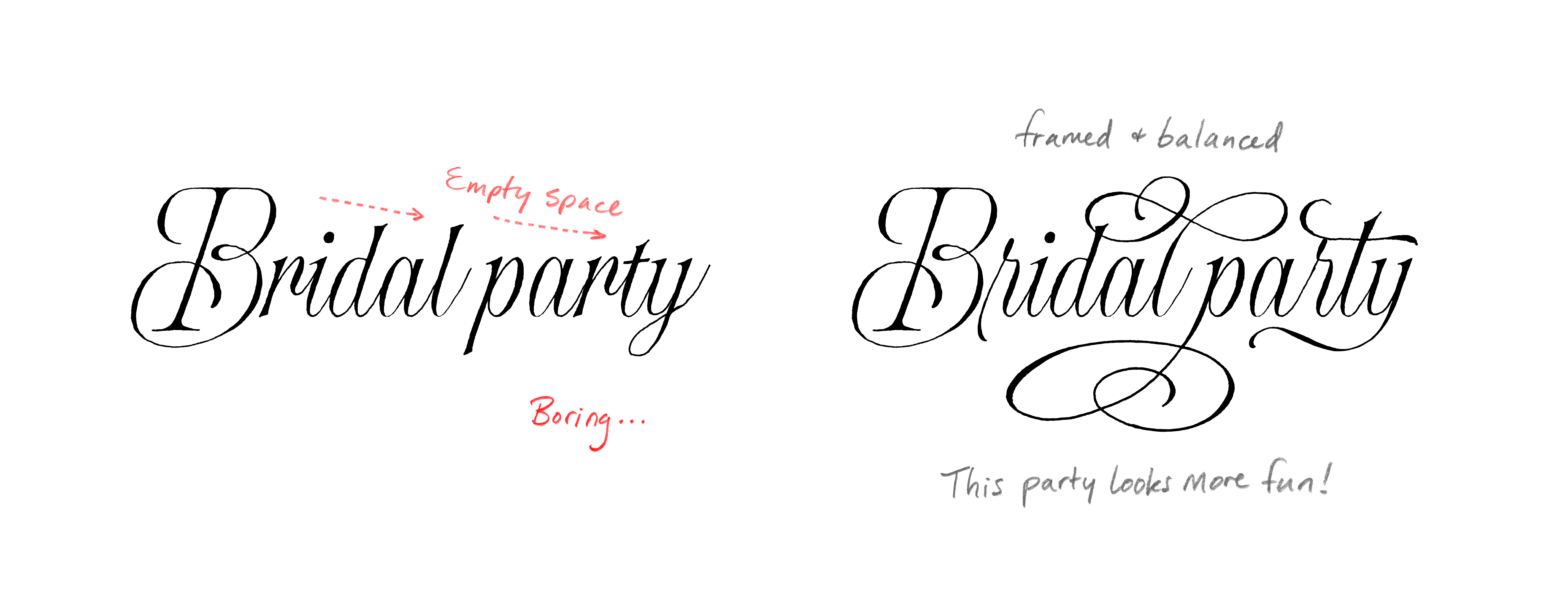 Font used: Proprietor Script
Unity & Harmony
OpenType features also help us keep things consistent. Are you using all caps or small caps? Use the appropriate numeral style to keep everything on the same visual level. Old style numerals are best paired with mixed caps to line up with ascenders and descenders.
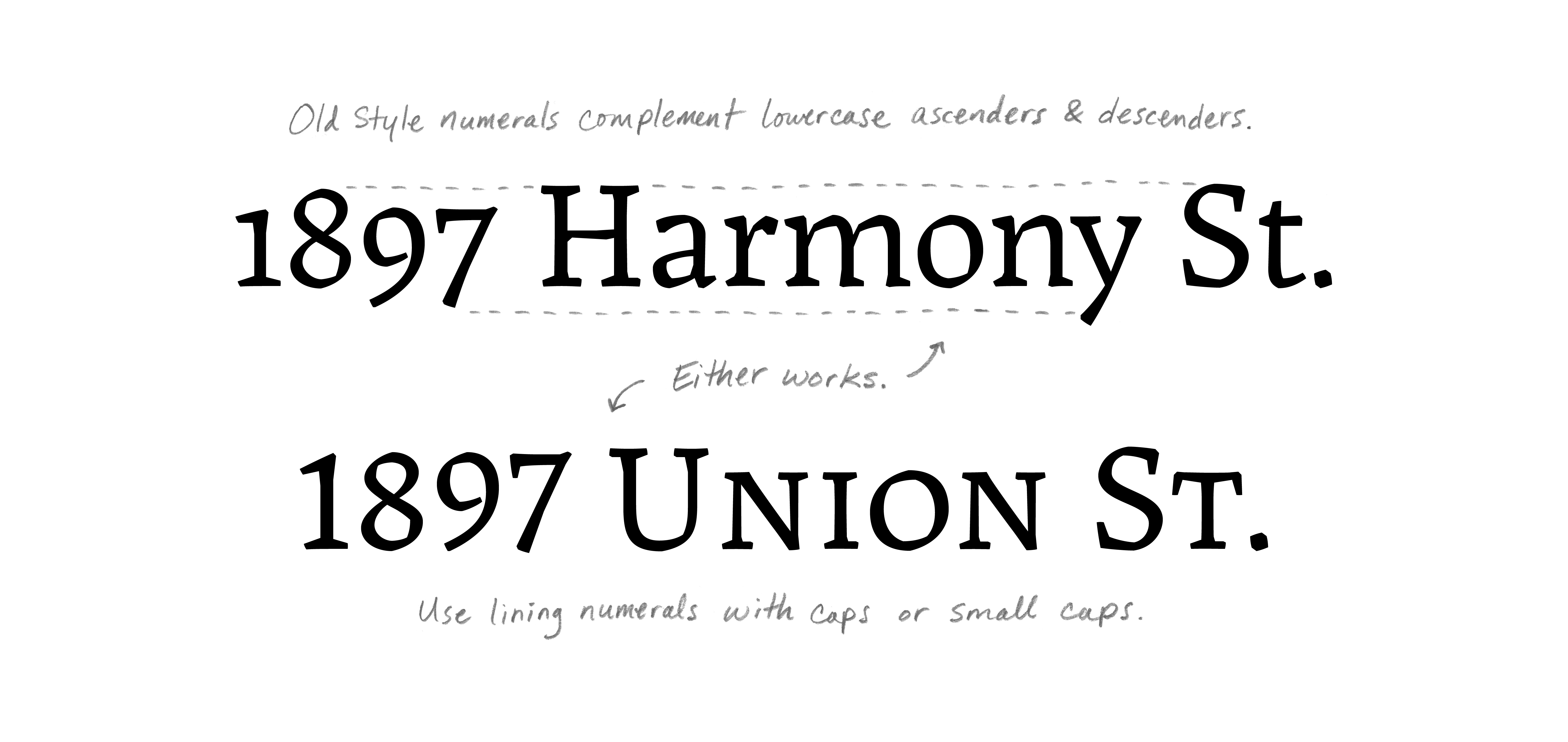 Font used: Landa
Beauty
Though readability is very important, we want our work to be more than just “legible”. We want it to look beautiful. Swashes, alternates, ornaments, and flourishes help to make work look finished and customized. When using brush scripts or hand display fonts, don’t shy away from OpenType alternates and swashes on repeated letterforms to make your designs look more authentic.
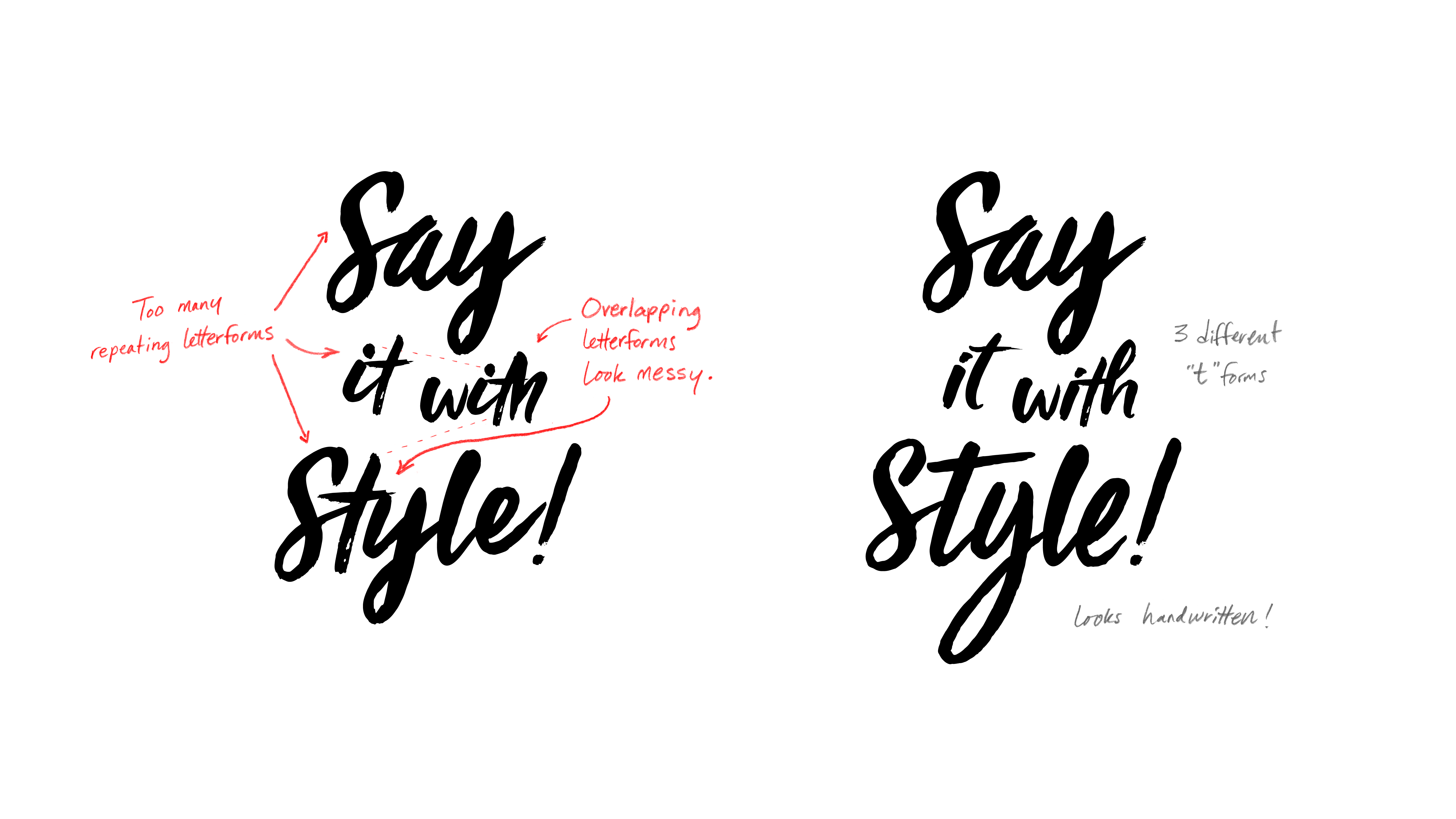 Font used: Viva Beautiful Pro
Of course, there are many more ways to implement OpenType features in your designs. If you’re new to the world of OpenType and need a quick overview of what it is and how to access these features in your programs, check out our OpenType 101 article and brief video tutorials.
Photoshop OpenType tutorial:
Illustrator OpenType tutorial:
InDesign OpenType tutorial:
If you need help with these features, feel free to email support@fontspring.com and our team will be happy to point you in the right direction!
This really helped me. I am enjoying my free time in my room from now on. Everything feels so relaxing and peacefully. Im looking forward to your next posts on this website.
Sincerely.
P.S.
Check this link out:
https://wofs.com