
Ten Years: Fenotype and Fontspring
An Interview with Emil Bertell of Fenotype
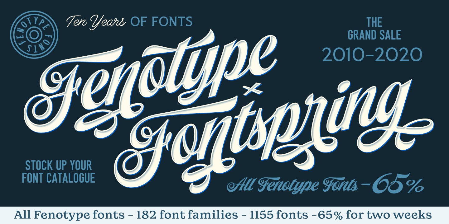
2020. Need I say more? Despite being a notorious year full of existential dread, we look ahead with optimism, and we look back at the journey so far. This year happened to mark the tenth anniversary of Fontspring’s first establishment in 2010. In true synchronicity, it also marks the ten year anniversary of Fenotype, an award-winning, top-selling Fontspring foundry.
To celebrate this occasion, Fenotype is currently offering 65% off their entire Fontspring catalog!
For those unfamiliar with the name, Fenotype is designer Emil Bertell’s Finland-based design company. You’ve seen many of his font families featured in our Best of Fontspring lists over the past few years:
Best of 2017: Karu, Letterpress Studio, Roster
Best of 2018: Double Porter (voted a Top-Tier Typeface)
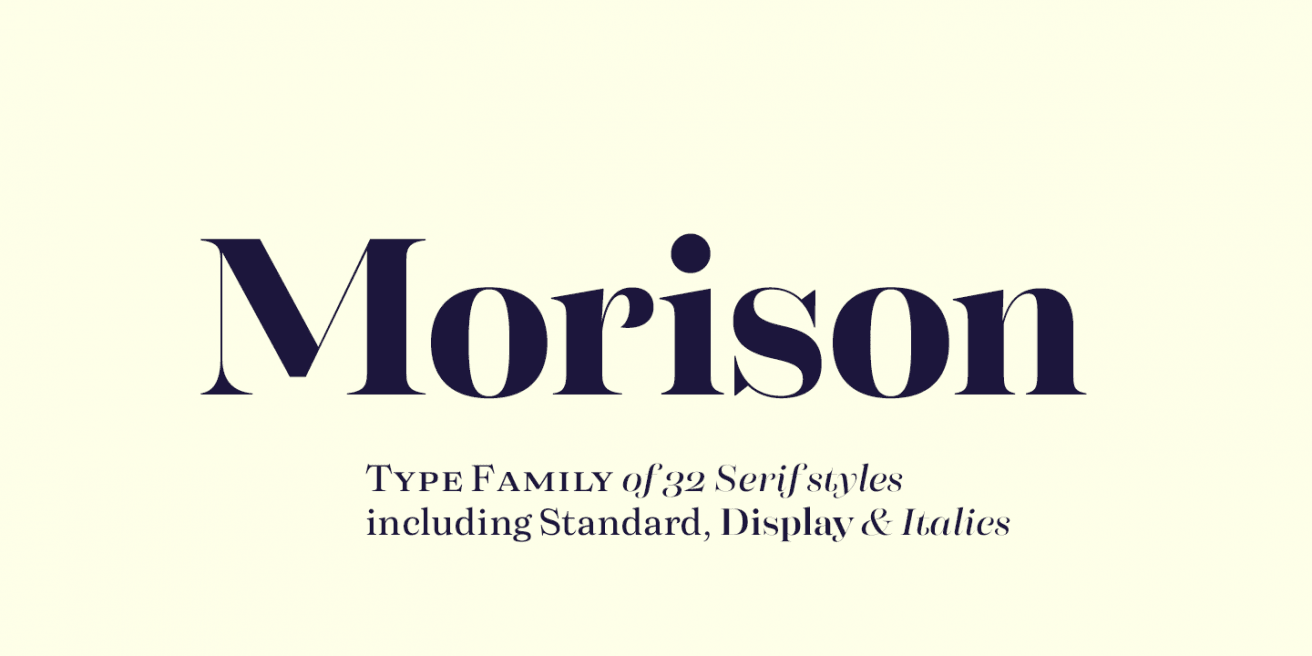
Best of 2019: Morison (voted a Top-Tier Typeface), Agile Sans, Fabrica, Hops & Barley, Zeit

We took some time to ask Emil a few questions about his work, to commemorate the decade-long partnership of Fenotype and Fontspring.
FS: What’s the origin of the name “Fenotype”?
EB: I liked the meaning of “Phenotype”: (the set of observable characteristics of an individual resulting from the interaction of its genotype with the environment) … Plus it has “type” in it. I also toyed with the idea of “Fennotype” as for Finnish-type but it felt too complicated and doesn’t look as good with the double n.

FS: How would you describe your style?
EB: Synthetic script with the idea of embracing the possibilities of vector design while trying to maintain the freedom of hand lettering (as much as possible).


FS: What inspired you to start designing your own fonts?
EB: I became aware of the concept of graphic design in high school. I attended an art-oriented school and we did coding, animation and graphic design. I had to design a calendar and I started to think about the huge impact that a typeface has in design, so I ended up creating my first typeface at the age of 16. The font wasn’t that brilliant though.
FS: If you had to pick a favorite, which of your font families would you choose?
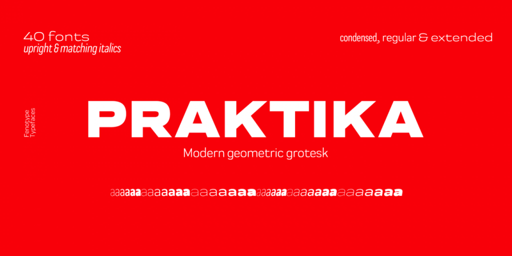
EB: Grand Atlantic, Slacker, Vodka, and Praktika to name a few.

FS: What have been the highlights of your typographic career?
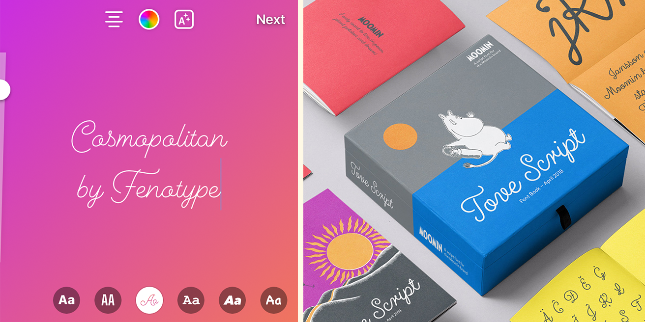
EB: As for visibility, the biggest one is most likely the “neon” typeface that users can utilize in Instagram Stories, that’s Cosmopolitan by me. Another really nice thing is that some years ago, Moomin Characters asked me to realize a script typeface based on the hand lettering of Tove Jansson, the author and creator of the Moomins. So that’s kind of a big deal here in Finland and probably in Japan too.
FS: What have you learned in your ten years that you wish you had learned sooner?
EB: First, I wish I’d stayed on my path with fonts from the beginning. I wish I had taken the time to learn drawing letters by hand earlier. That’s proven very useful skill when designing typefaces.
FS: What other non-typographic things are you inspired by?
EB: Three years ago I re-found skateboarding after 17 years of break. I like cooking. During the lockdown I’ve learned to cook some even more ambitious dishes.
FS: Can you tell us a bit about your illustration work?
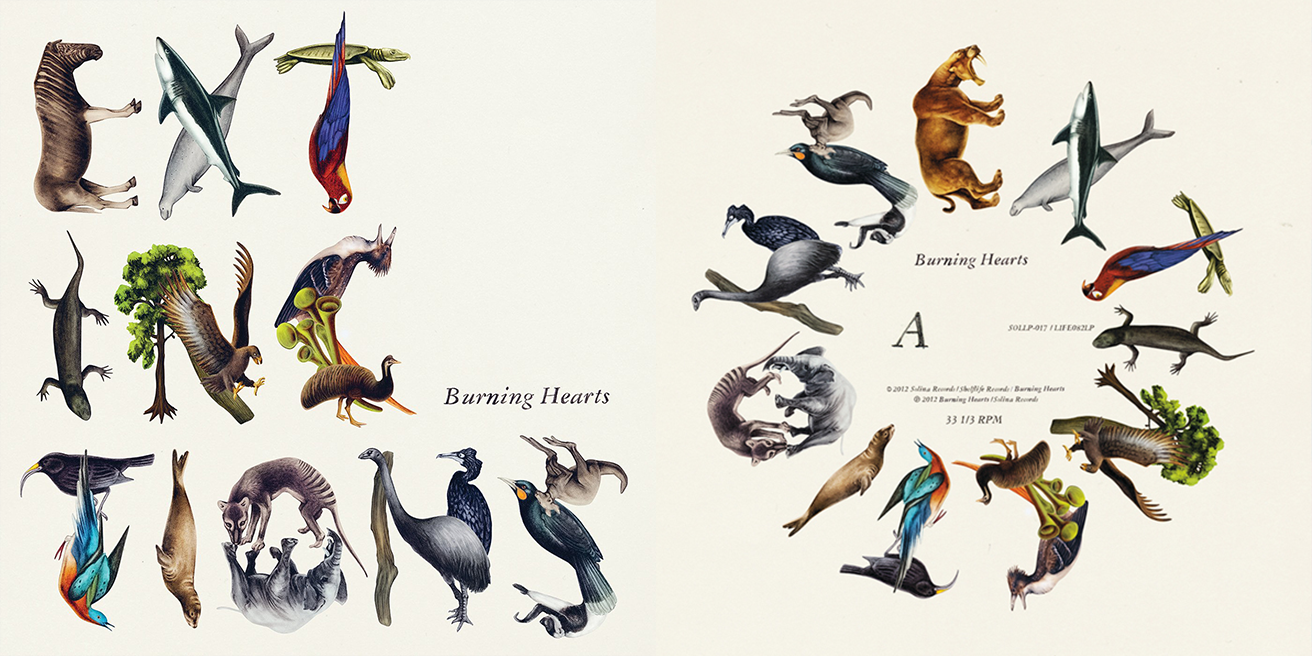
EB: In 2007 I was studying at the University of Art & Industrial Design and I joined the freshly founded illustration agency, Agent Pekka. I drew realistic pencil-drawn illustrations coloured in Photoshop and it was a rather painstaking effort. I worked as a full time illustrator for 4 years drawing day and night, illustrating for advertising agencies and magazines. I even won the Mikkeli Illustration Triennial (a Finnish illustration competition). When my daughter was born I shifted my focus towards type design because illustrating was so exhausting.
FS: What does your type design process look like?
EB: There are many ways to design a type family. Sometimes I sketch with pen and paper, and sometimes with Procreate, but often I just start drawing letter shapes in Illustrator.
EB: When working on a script font, I usually start with lowercase a. I might spend quite a lot of time on the first letter, and then expand it to h, r, s, and so on. Once I’m happy with the first 6-10 letters, the rest of the lowercase comes easier. Many times I work on the lowercase for quite a while before even concerning myself about uppercase, so I might have plenty of contextual alternates and ligatures in lowercase before even drawing my first uppercase letter.
EB: When I’ve got the lowercase and uppercase done and working, I design punctuation and usually I need to have a complete working font before I design any extras, swashes, titling alternates, and so on. During this step, I export the font continuously and test it with long texts. When I’ve got the whole font working, I test the font in several languages.
EB: Then when I have the font set ready, I start working on the release. I usually start with the posters. The font family might sometimes surprise me. If it doesn’t look as good to me as I had intended, I try something different until I find a visual angle or concept where the font family looks to fit naturally.
EB: As the font designing is somewhat monotonous work and very little communication with the outside world, I sometimes spend extra time on the posters, to get a change in my work and also to keep my illustration and graphic design skills in shape. It’s also way more fun and often more quickly rewarding than working on a font (which takes weeks). Poster design is also important as a part of the font testing. A lot of times, I come up with the name and add some extra little features while designing the posters.
Be sure to take advantage of Fenotype’s foundry-wide sale while you can! The sale lasts until November 26th. You can view his entire catalog here.
Fonts can really help you change your entire project, as they can show so many emotions and expressions. I loved how you mentioned all of them at once. Thanks for sharing this.